Diptych-A work made up of two matching parts.
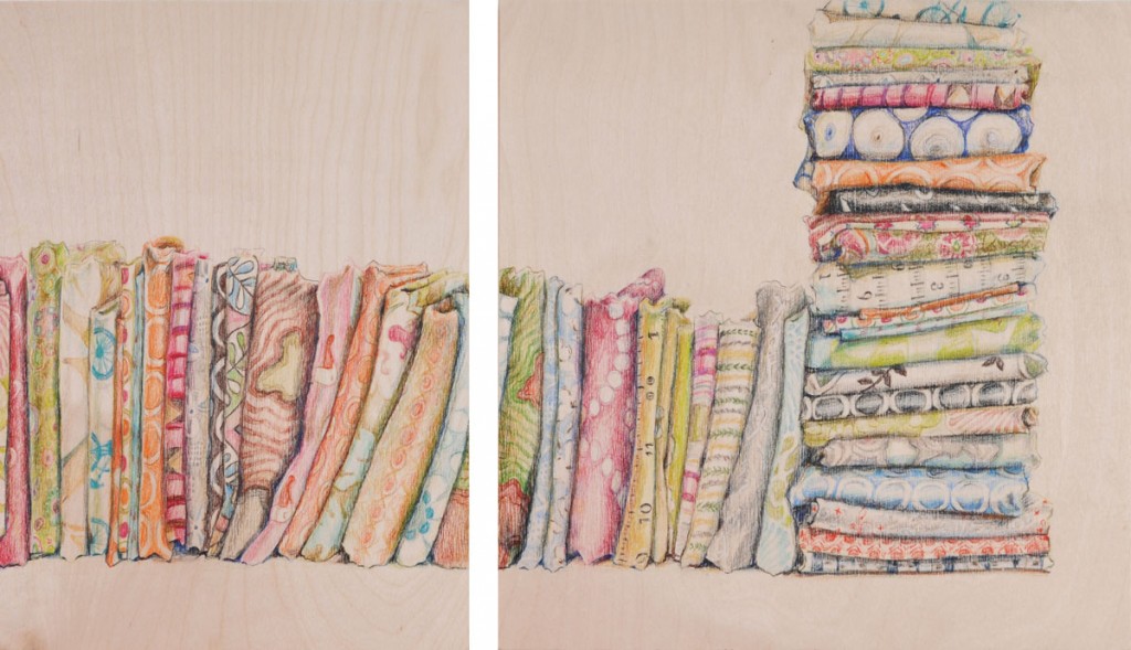
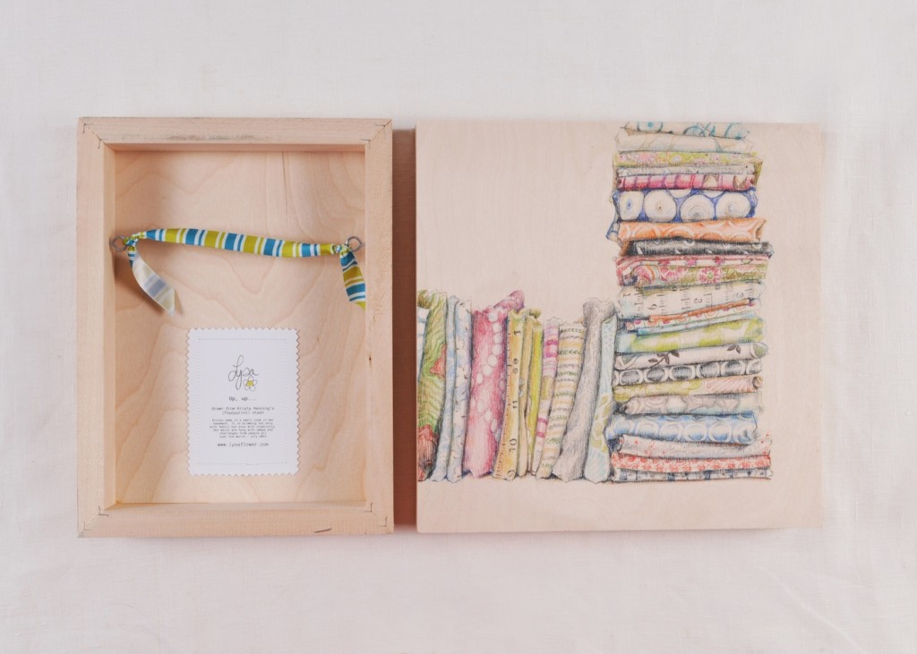
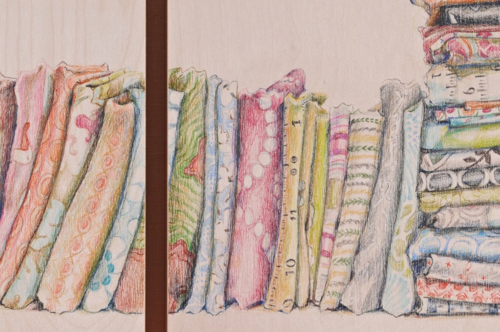
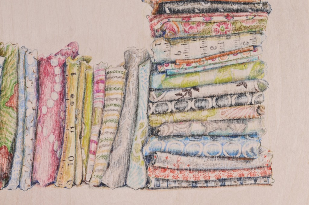
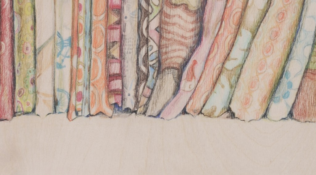
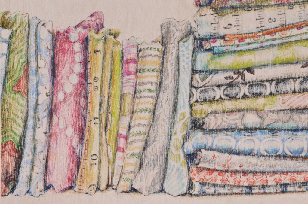
When I first sat with Krista’s fabric stash I didn’t have to spend too long on the composition. Right away I started stacking the fabric, I knew immediately I wanted to try a diptych. In the end I made two from her stash. This is the first one.
The drawing on the right is called, “Up, up…” The drawing on the left is called, “…And Away”
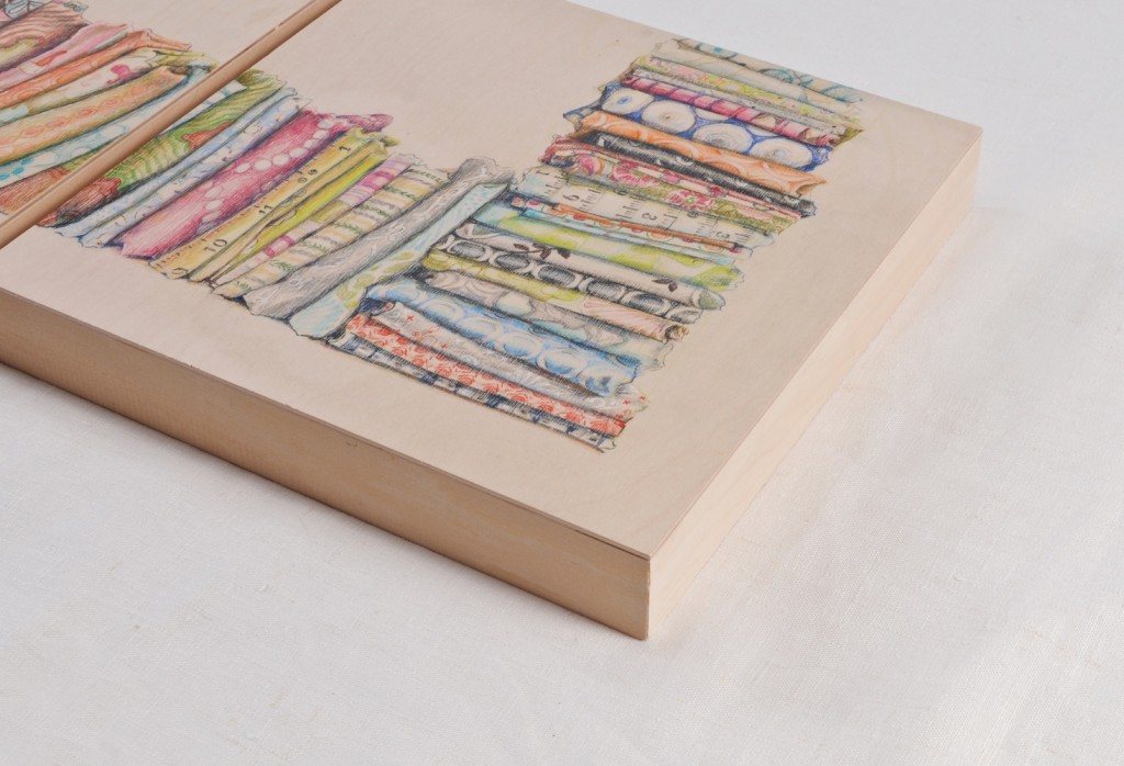
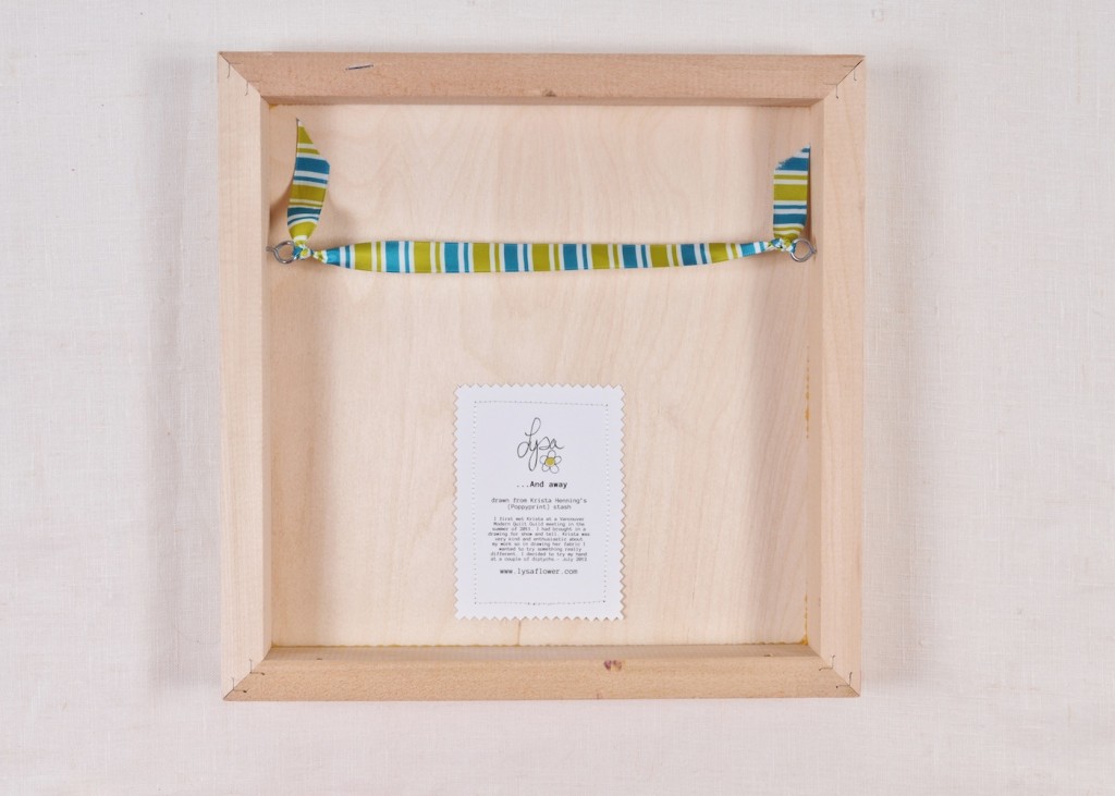
Both were drawn on wood canvases, 2″ deep, my standard M.O. Each drawing is finished with a ribbon hanger along with a story about the stash. I believe backs should be considered just as much as the front, don’t you?
“Up, up…” Measures 9″ high and 12″ deep. “…And Away” measures 12″ high and 12″wide.
*psst* you want to know a secret?… This is one of my favourites… shh! Don’t tell the other drawings.
UPDATE: My year of living “Fearlessly“: I’ve started my course of Make it in Design. There have been many deep breaths, a few brief pauses, followed by throwing caution to the wind plunges! I bob from knowing what I’m doing to, woe I need to swim back to shore now. They do encourage us to take things at our own pace but of course I don’t want to get behind either. Yup, there’s been a lot of concentration on balance. I’m working out the kinks with our schedules and balancing social media VS. drawing/making. All in all, so far so good.
If you want to see what I’ve been up to but you’re not on Instagram (Hana-tease, tease), or Facebook (Hana-tease, tease!) you can just click on those two links to take a peek. My friend Hana has been requesting updates on what I’m up to but she isn’t on any social media. I love to see when she uses her cel phone… the flip top makes me giggle and I love her for it!
Thanks so much for popping by!

Permalink
These are the drawings of the mercantile sewing accessories are definitely my favs
Permalink
Oooh man oh man oh man, Lysa, these are exquisite! If I didn’t already have a whole collection of your works I would have swiped it when nobody was looking!
Permalink
I did a brief sojourn in graphic design in my early twenties. While the instructor we had was a horrible human being (Dolores Umbridge from Harry Potter comes to mind), one of her lessons did stick.
We were assigned the typical three-fold brochure, with some means of displaying it. Inspiration was to be taken from a piece of architecture. When everyone turned their project in, she harangued us for deigning the brochure, but not giving through to what displayed it.
Hence, your ribbon hanger is awesome, and indeed, backs are just as appropriate as fronts (ask any lady of means I. The 18th century when you had to have a maid to dress you
Permalink
Oh my gosh….beautiful. BEAUTIFUL!! I love your art work. Where can I find more? Maybe some for myself…